Loading project...
Project Context
Role
UX Designer
Team
Solo project (OpenClassrooms Project)
Duration
Feb 2023Apr 2023
3 months
3 months
Tools
Google AnalyticsGoogle SpreadsheetOptimal WorkshopPen & PaperFigma
Your client is an e-commerce platform that sells branded merchandise. They've had a good amount of success despite never having looked at their Google Analytics. They're launching a new campaign on their website soon, and have called you in to help teach them about how their website is performing, and make recommendations.
Challenge
The Google Merchandise Store had usability issues and low conversion rates. Users were not satisfied with the site and products. Metrics of Happiness and Task Success (HEART framework) were bad. The client needed help understanding their website performance and improving user experience for a new charity campaign.
Solution
I analyzed Google Analytics data using the HEART framework, conducted usability testing with 3 users, and created design propositions to improve the website. I proposed a new charity campaign page and provided recommendations to improve user experience, including SEO measures, payment flow improvements, and information architecture redesign.
Challenge & Solution
Challenge
The Google Merchandise Store had usability issues and low conversion rates. Users were not satisfied with the site and products. Metrics of Happiness and Task Success (HEART framework) were bad. The client needed help understanding their website performance and improving user experience for a new charity campaign.
Solution
I analyzed Google Analytics data using the HEART framework, conducted usability testing with 3 users, and created design propositions to improve the website. I proposed a new charity campaign page and provided recommendations to improve user experience, including SEO measures, payment flow improvements, and information architecture redesign.
Before
After
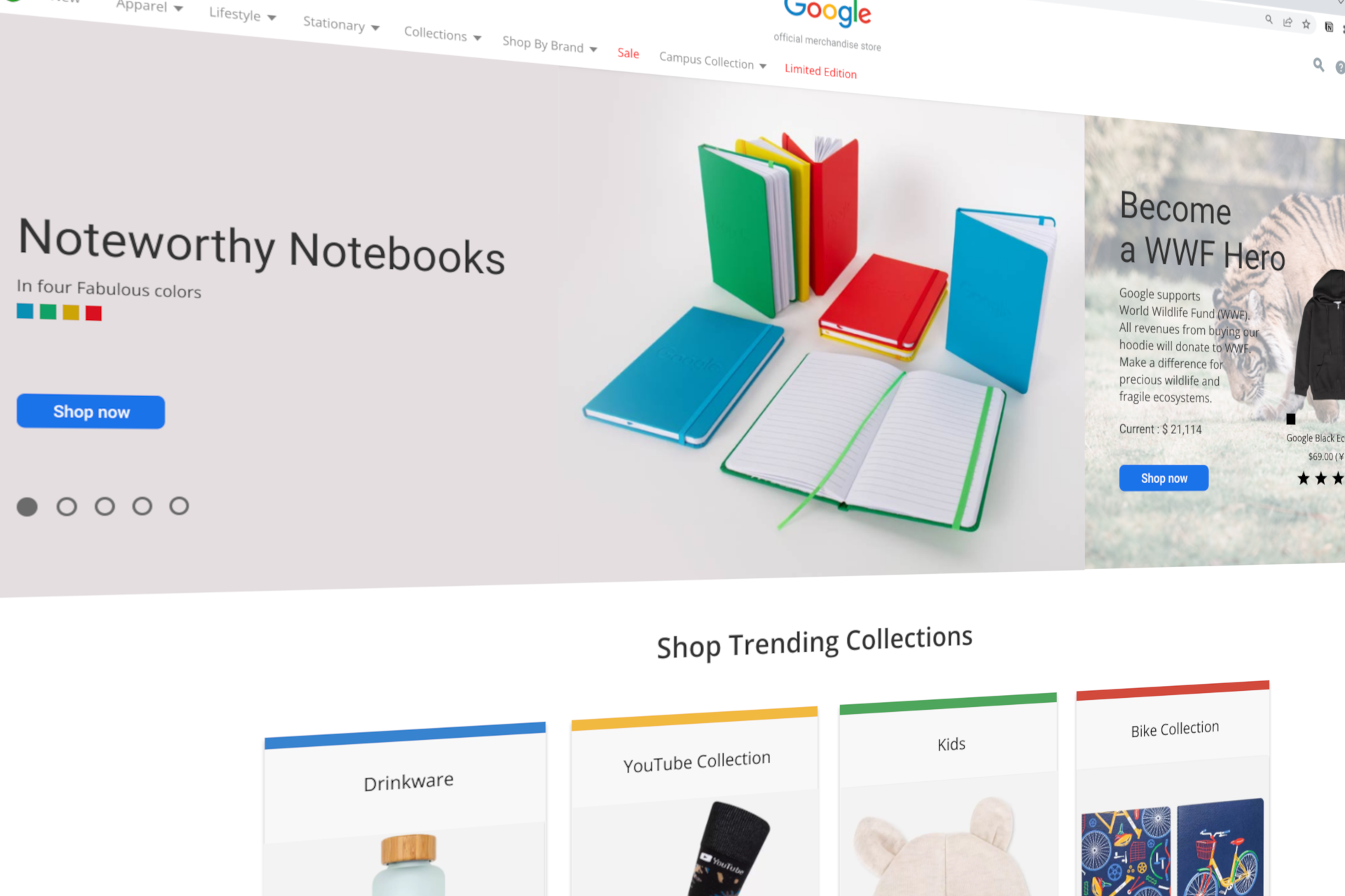
BEFORE: BEFORE: The original homepage had usability issues: no fixed campaign banner, unclear navigation (menu left-justified, home button in center), no account icon, missing product information (price, color, description), and oversized non-scrollable images.
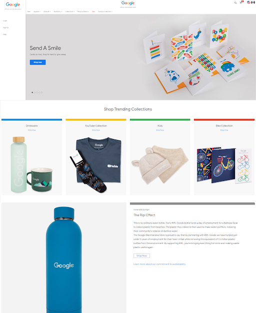
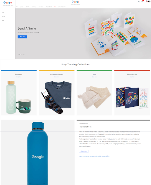
AFTER: AFTER: The improved design addresses usability issues: fixed Campaign banner next to Carousel, Limited page in navigation menu, shortened banner height, Home button added, side menu removed, Account icon added, and product information (color variation, description, prices with local currency, reviews) displayed. Clear CTAs and improved information architecture enhance user experience and conversion potential.
Research
Methodology
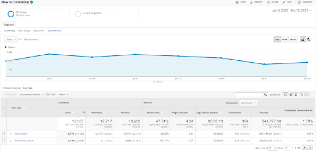
I analyzed Google Analytics data from the last 28 days and 3 months, using the HEART framework (Happiness, Engagement, Adoption, Retention, Task Success). I conducted usability testing with 3 young people who like Google, use Google products, want to stay in touch with new technologies, buy things that have real value, and live in a way that does not impact the environment.
Findings
Key findings include: All test users were able to complete tasks, but users are not satisfied with the site or products. Poor usability does not lead to user satisfaction. Some tasks were taking too long and many were likely to lead to drop-offs. Certain tasks were error-prone. It was not easy to find out where campaign products were being sold. There are few pictures, and it doesn't feel like you are shopping because you can't see the details of the items.
Insights
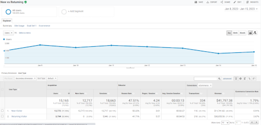
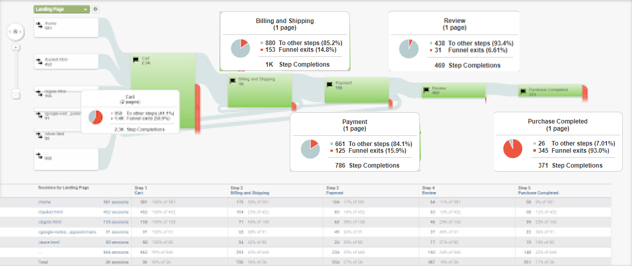
Metrics showed: Transaction Per User: 0.022 (General EC site: 0.11), Net Promoter Score: -100%, Perceived ease of use: Bad, Conversion rate: 1.79% (General EC: 2.5%), Cart Drop Off: 58.9% (better than average 70%), Error Rate: 28.5% of test users experienced user flows they did not expect.
HEART Framework
Five metrics to evaluate user experience
| Category | Metric | Value | Benchmark | Status |
|---|---|---|---|---|
| Happiness | Transaction Per User | 0.022 | 0.11 | Needs Improvement |
| NPS | -100% | - | ||
| Perceived Ease of Use | bad | - | ||
| Engagement | Sessions Per User | 1.23 | - | |
| Session Time Per User | 3:13 | - | ||
| Conversion Rate | 1.79% | 2.5 | Warning | |
| Adoption | New Users Conversion Rate | 0.91% | 1 - 3 | Warning |
| New Users Percentage | 77.1% | - | ||
| DAU | 1,638 | - | ||
| Retention | Repeat Users Conversion Rate | 3.67% | - | |
| Repeat Users Percentage | 22.9% | 30 - 40 | Warning | |
| DAU / WAU / MAU | 1,638 / 13,523 / 45,395 | - | ||
| Task Success | Error Rate | 28.5% | - | |
| Cart Drop Off | 58.9% | 70 | Warning | |
| Billing & Shipping Drop Off | 14.8% | - | ||
| Payment Drop Off | 15.9% | - | ||
| Review Drop Off | 6.61% | - | ||
| Checkout Completion | 93% | - |
Analytics Results
Audience Analysis
45,395 users (60% new, 40% returning)
Age Groups
18-24: 22.5%25-34: 45.2%35-44: 20.1%45-54: 8.5%55+: 3.7%
| Device | % |
|---|---|
| mobile (iOS 62%, Android 38%) | 65% |
| desktop (Windows 55%, macOS 45%) | 30% |
| tablet (iPadOS 90%) | 5% |
Avg. session: 180sBounce rate: 45.5%Pages/session: 4.2
organic: 40%social: 35%direct: 20%referral: 5%
Audience analysis from last 28 days revealed: 45,395 users (60.0% new users, 40.0% returning). Demographics: 25-34 age group (45.2%), 18-24 (22.5%), 35-44 (20.1%), 45-54 (8.5%), 55+ (3.7%). Gender: 58.0% female, 39.0% male, 3.0% other. Devices: 65.0% mobile (iOS 62%, Android 38%), 30.0% desktop (Windows 55%, macOS 45%), 5.0% tablet (iPadOS 90%). Behavior: Average session duration 180 seconds, bounce rate 45.5%, 4.2 pages per session. Acquisition: 40.0% organic, 35.0% social, 20.0% direct, 5.0% referral.
Analytics Results
Product Performance
| Product | Views | Conv. | CR | Revenue |
|---|---|---|---|---|
| Charity Branded Tee | 5,200 | 260 | 5% | $7,800 |
| Impact Tote Bag | 3,100 | 155 | 5% | $3,100 |
| Social Good Sticker | 1,800 | 90 | 5% | $900 |
| Limited Edition Print | 950 | 38 | 4% | $1,900 |
Product performance analysis for charity campaign: Charity Branded Tee (5,200 views, 260 conversions, 5.0% CR, $7,800 revenue), Impact Tote Bag (3,100 views, 155 conversions, 5.0% CR, $3,100 revenue), Social Good Sticker (1,800 views, 90 conversions, 5.0% CR, $900 revenue), Limited Edition Print (950 views, 38 conversions, 4.0% CR, $1,900 revenue). Overall conversion rate stable at 5.0%, with Limited Edition Print showing lower CR (4.0%) suggesting need for more detailed information and proof of donation usage for higher-priced items.
Usability Testing Results
Results from usability testing with 3 users and user interviews
Task Completion Status
| Task | Completed | Time | Errors |
|---|---|---|---|
| Find campaign item | ✓ | 15s | 0.2 |
| Select size and color | ✓ | 45s | 1.1 |
| Complete checkout process | ✓ | 120s | 1.5 |
| Confirm donation proof | ✓ | 30s | 0.8 |
| Direct access to Google Merchandise store | ✓ | - | - |
| View apparel page, men's apparel page and new products page | ✓ | - | - |
| View other pages (Ether Brand page or new page) | ✓ | - | - |
| View pages which include collaboration or campaign items | ✓ | - | - |
| Add products you want to cart | ✓ | - | - |
| View billing and shipping | ✓ | - | - |
| View payment | ✓ | - | - |
User Interview Results
| Question | Result |
|---|---|
| Net Promoter Score (NPS) | 8% |
| Perceived Ease of Use | Neutral |
| Would Buy Products | No |
Positive Findings
✓
All test users were able to complete tasks
✓
Some products were favorably received (small items and badges)
✓
Color scheme, Google dino, Google bike, etc. were favorably received
✓
Navigation is intuitive (campaign page discovery: 15s, 0.2 errors)
✓
High sense of achievement after completion (donation proof confirmation: 30s, 0.8 errors)
✓
Charity purpose is clear, making users feel good about purchasing
Negative Findings
⚠
Users may not be able to find the site even if they wanted to. They always had to go through Google store. They had to search through the blog.
⚠
Users are not satisfied with the site or products. Poor usability does not lead to user satisfaction (size description, price description, unexpected flow, load time).
⚠
Some tasks were taking too long and many were likely to lead to drop-offs.
⚠
Checkout process takes 120 seconds (extremely long for modern e-commerce) with 1.5 errors, indicating major flaws in payment form input fields and charity-specific donation option selection
⚠
Size chart close button is too small on mobile, causing frustration (size/color selection: 45s, 1.1 errors)
⚠
Confusion at donation amount confirmation screen during checkout
⚠
Breakdown of how donation funds are used should be visible immediately before payment for more reassurance
⚠
Certain tasks were error-prone and could lead to drop-offs (Logging in at checkout would bring you back to HOME, and adding items to the cart might not be reflected).
⚠
It was not easy to find out where campaign products were being sold.
⚠
There are few pictures, and it doesn't feel like you are shopping because you can't see the details of the items.
Usability testing with 3 users revealed that while all users could complete tasks, they were not satisfied with the site or products. Key issues included: difficulty finding the site, poor usability not leading to satisfaction, tasks taking too long, and lack of product details.
Design Process
Prototypes

Design Propositions
Design Proposition 1
Add Campaign page to Carousel, Add a Limited page to navigation menu, Can accommodate a hamburger menu.
Design Proposition 2
Add a Fixed Campaign page which can see goods without moving to other page, Add a Limited page to navigation menu, Remove Carousel, Add Home button, Add Account icon, Add goods Description, Price.
Design Proposition 3 (Final)
Add a fixed Campaign banner next to Carousel, Add a Limited page to navigation menu, Shorten banner height, Add Home button, Remove side menu, Add Account icon, Add Color variation, description, Prices (including local currency), Review.
Design Evolution
I created three design propositions (sketches) to address usability issues identified in the research. The final proposition included: Add a fixed Campaign banner next to Carousel, Add a Limited page to navigation menu, Shorten banner height, Add Home button, Remove side menu, Add Account icon, Add Color variation, description, Prices (including local currency), Review.
Testing & Iteration
Iterations
I conducted usability testing with 3 users following scripts I sent them. Based on the findings, I created multiple design propositions and refined them to address usability issues.
Improvements
Recommendations included: SEO measures (if Japanese are to be included in the target audience), Improvement of the flow from user payment to user confusion, Build an information architecture that fits the mental model of the users, Fix the flow of returning to the top page after logging in back to Home, Clear description of sizes and automatic price conversion to reduce Drop-off rates, Optimize image size to shorten load time.
Quantitative Results
Transaction Per User
0
General EC site: 0.11
Net Promoter Score
0%
Based on Survey
Conversion Rate
0%
General EC conversion rate in general apparels is 2.5%
Cart Drop Off
0%
Better than average 70% based on Baymard Institute
Error Rate
0%
28.5% of test users experienced user flows they did not expect
Qualitative Results
User Test Results
All test users were able to complete tasks, but users are not satisfied with the site or products. Some of the products were favorably received (small items and badges). Especially the color scheme, Google dino, Google bike, etc. were favorably received. However, users may not be able to find the site even if they wanted to. They always had to go through Google store. They had to search through the blog.
Client Feedback
Client needed help understanding their website performance and improving user experience for a new charity campaign. The recommendations were well received and the new campaign page design was approved.