Loading project...

Project Context
Role
UX Designer
Team
Solo project with mentor feedback
Duration
Jan 2023Jan 2023
1 months
2-week sprint cycle (16 days)
Constraints
Time
2-week sprint cycle
Tools
TrelloJiraFigmaWhimsicalOptimal Workshop
I worked on a project to improve the landing page of Kopernik's website, a non-profit organization in a 2-week sprint cycle. I clarified the website's roadmap related content and tasks, identified by investing mental models and usability, and proposed multiple design alternatives.
Challenge
Kopernik's website had usability problems including unclear information architecture, duplicate content, and confusing navigation. Users were not happy with the site despite being able to complete tasks. The landing page did not easily convey the organization's track record, and users needed to explore different pages in depth.
Solution
I conducted Hybrid Card Sorting and Usability Testing to identify user mental models and usability issues. Based on the findings, I proposed two design alternatives that addressed the identified problems, including decluttering the landing page, adding donation CTAs, displaying organization performance metrics, and reorganizing content according to mental models.
Challenge & Solution
Challenge
Kopernik's website had usability problems including unclear information architecture, duplicate content, and confusing navigation. Users were not happy with the site despite being able to complete tasks. The landing page did not easily convey the organization's track record, and users needed to explore different pages in depth.
Solution
I conducted Hybrid Card Sorting and Usability Testing to identify user mental models and usability issues. Based on the findings, I proposed two design alternatives that addressed the identified problems, including decluttering the landing page, adding donation CTAs, displaying organization performance metrics, and reorganizing content according to mental models.
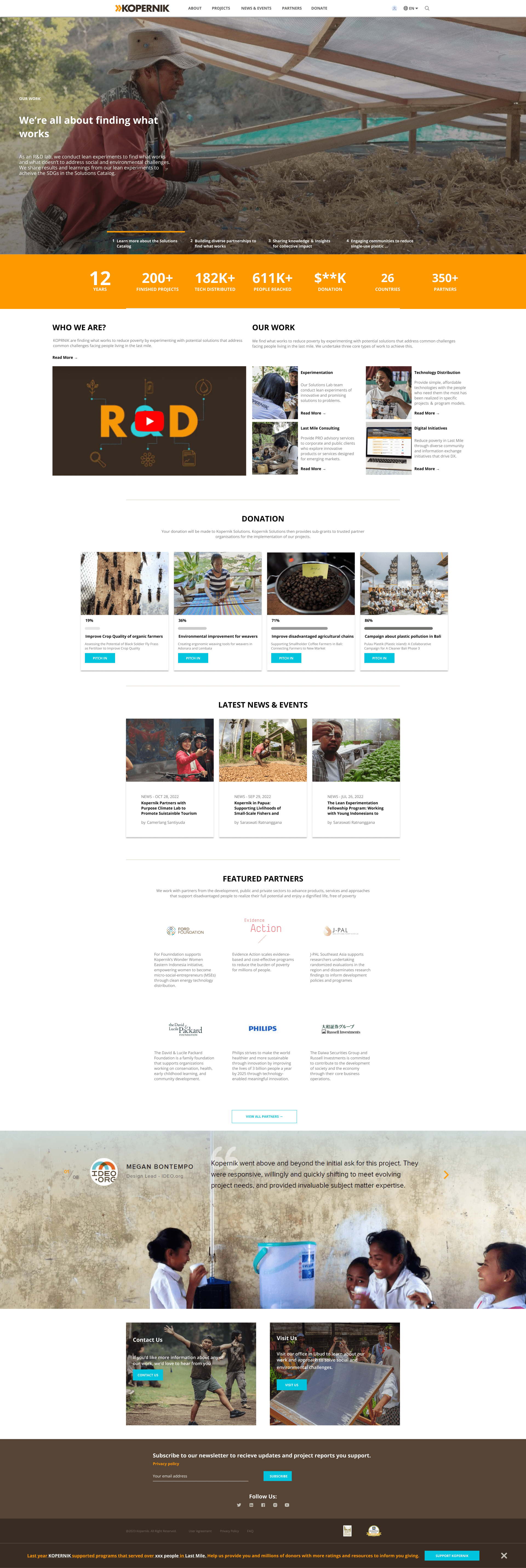
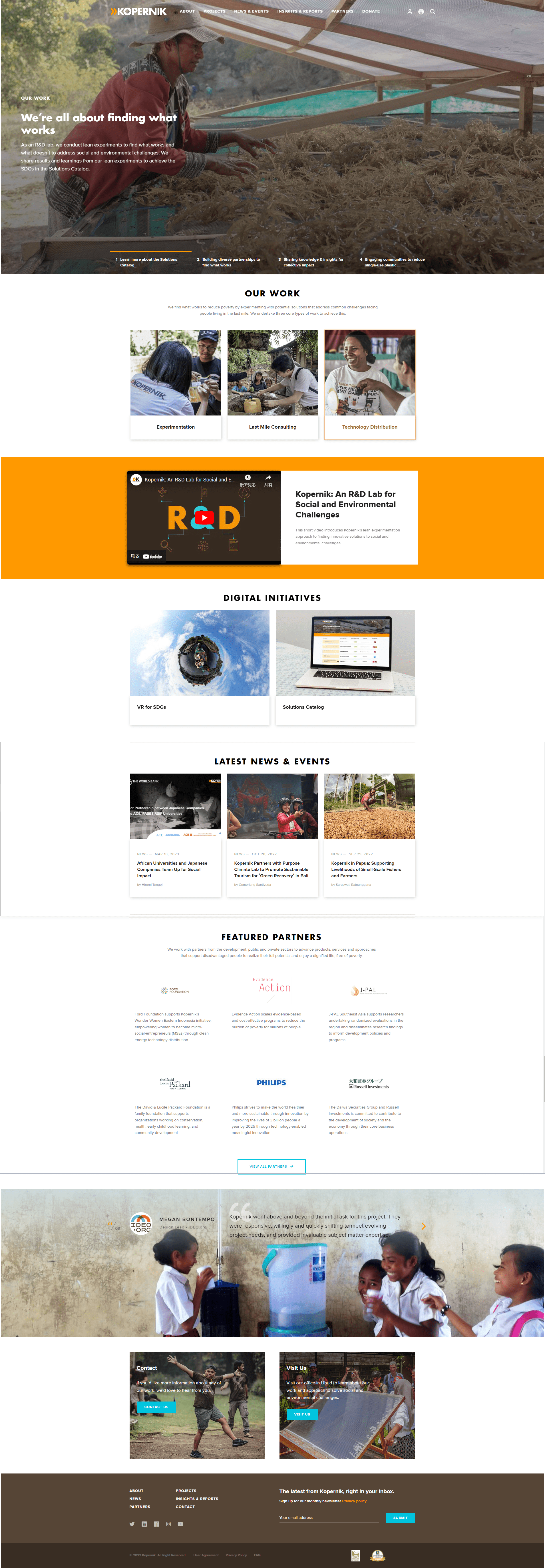
Before
After
BEFORE: BEFORE: The original landing page had usability issues: unclear information architecture with duplicate navigation elements, confusing footer structure, and lack of donation CTAs. Users struggled to find project information and donation options.
AFTER: AFTER: The redesigned landing page addresses usability issues: decluttered navigation with consolidated menu items, clear donation CTAs prominently displayed, content reorganized according to user mental models from card sorting, and improved information hierarchy.
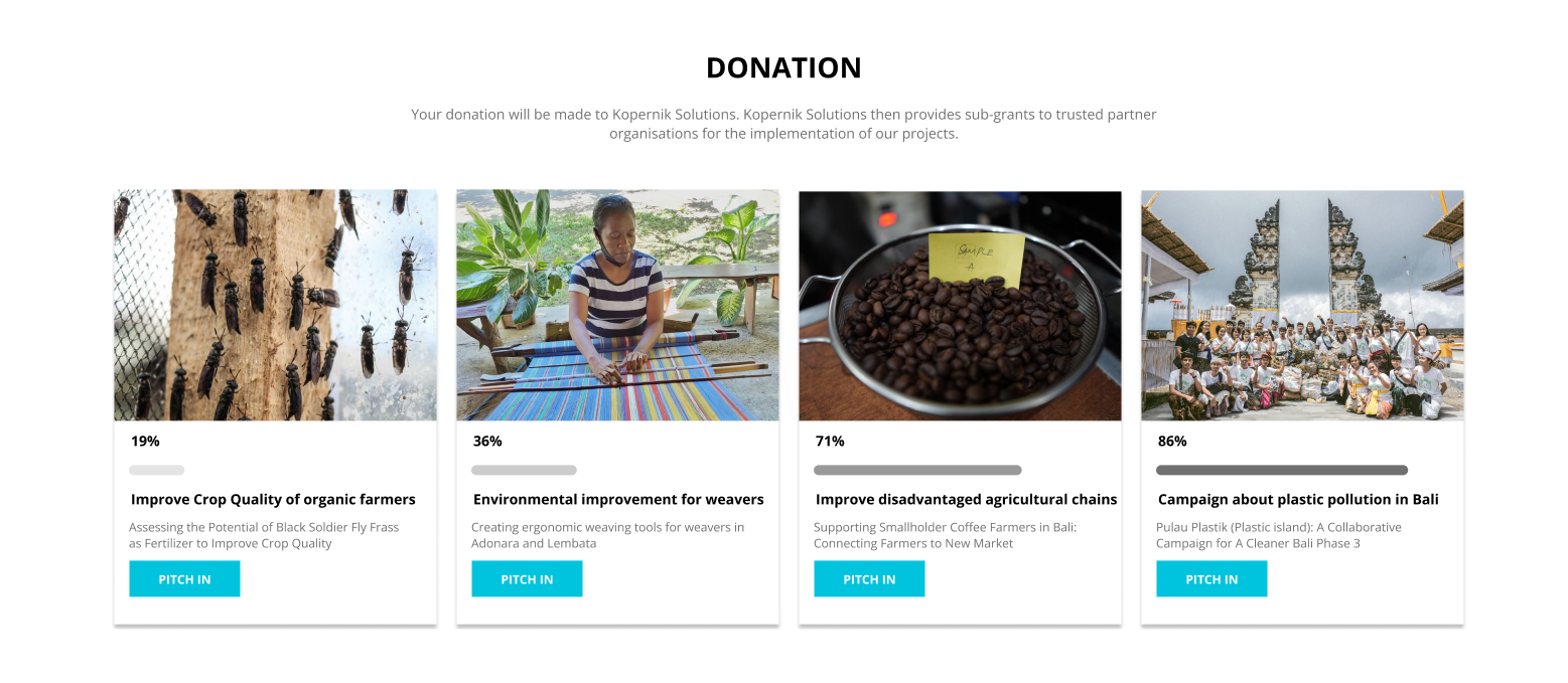
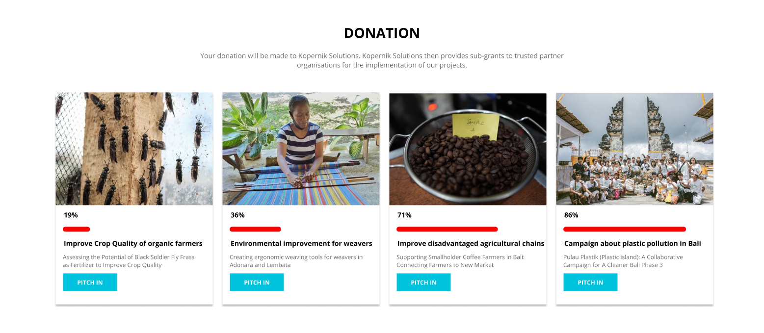
Before
After
BEFORE: BEFORE: The original donation content page had unclear layout and lacked prominent call-to-action buttons. Users had difficulty understanding how to donate and what their donation would support.
AFTER: AFTER: The redesigned donation content page features clear layout with prominent donation CTAs, improved visual hierarchy, and better explanation of how donations support projects. This improves user engagement and conversion rates.
Research
Methodology
Hybrid Card Sorting (Optimal Workshop) and Usability Testing with 3 participants who have donated or would like to donate to the organization.
Findings
All test users were able to complete tasks, but the website had usability problems. Key findings included: users not knowing the difference from other NPOs, users not believing projects are really taking place, confusing navigation names in Japanese version, and unclear content intent.
Insights
The card sorting results showed that the original placement is relatively acceptable, but content needs to be reorganized according to mental models. Users need easily visible content such as history, number of projects, number of partners, and amount of donations to understand the organization's track record.
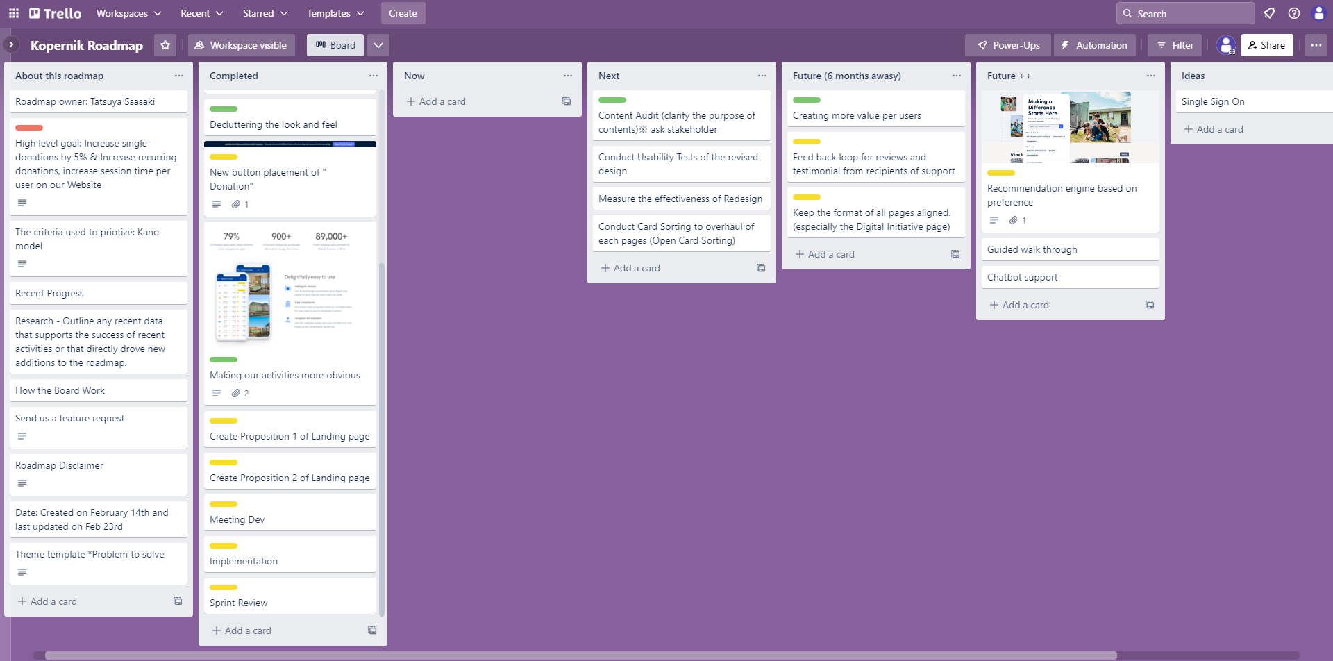
Project roadmap outlining the 2-week sprint cycle, key tasks, and milestones for the Kopernik website redesign project.
Data Visualization
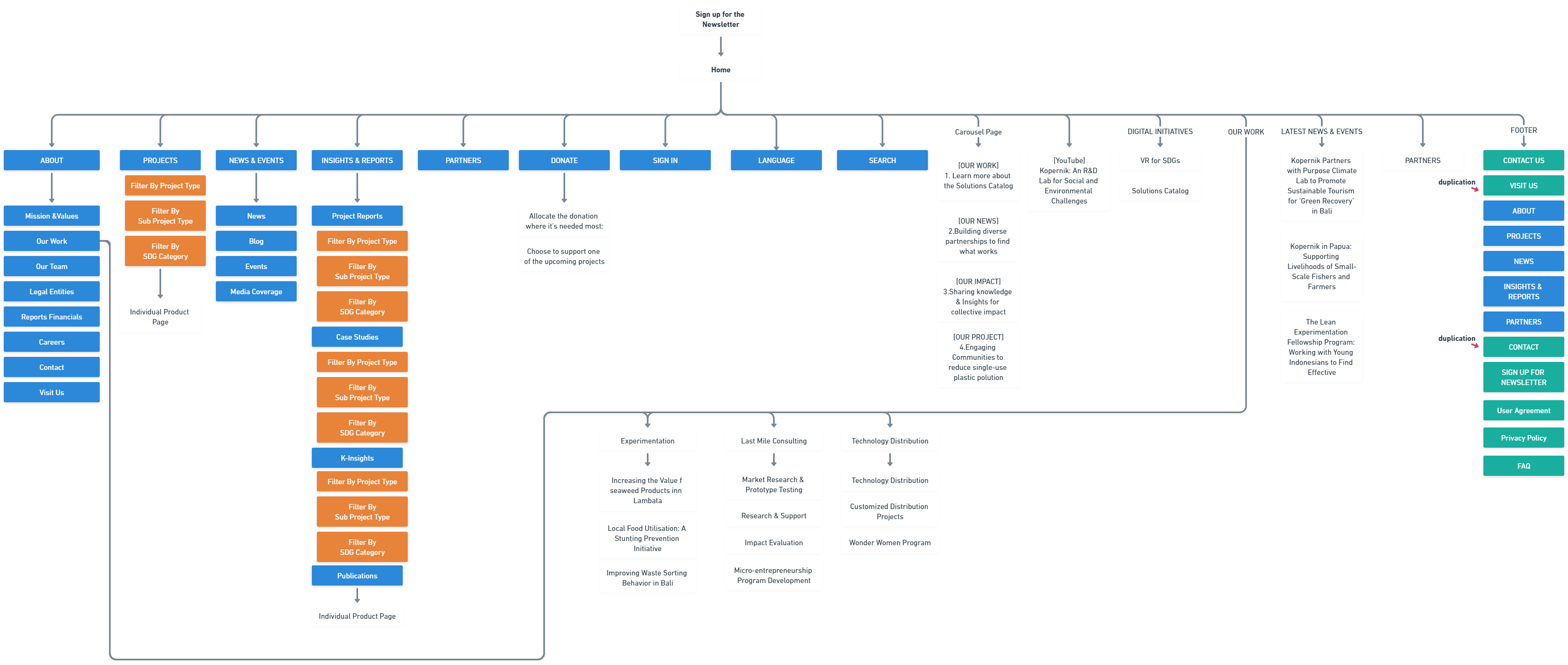
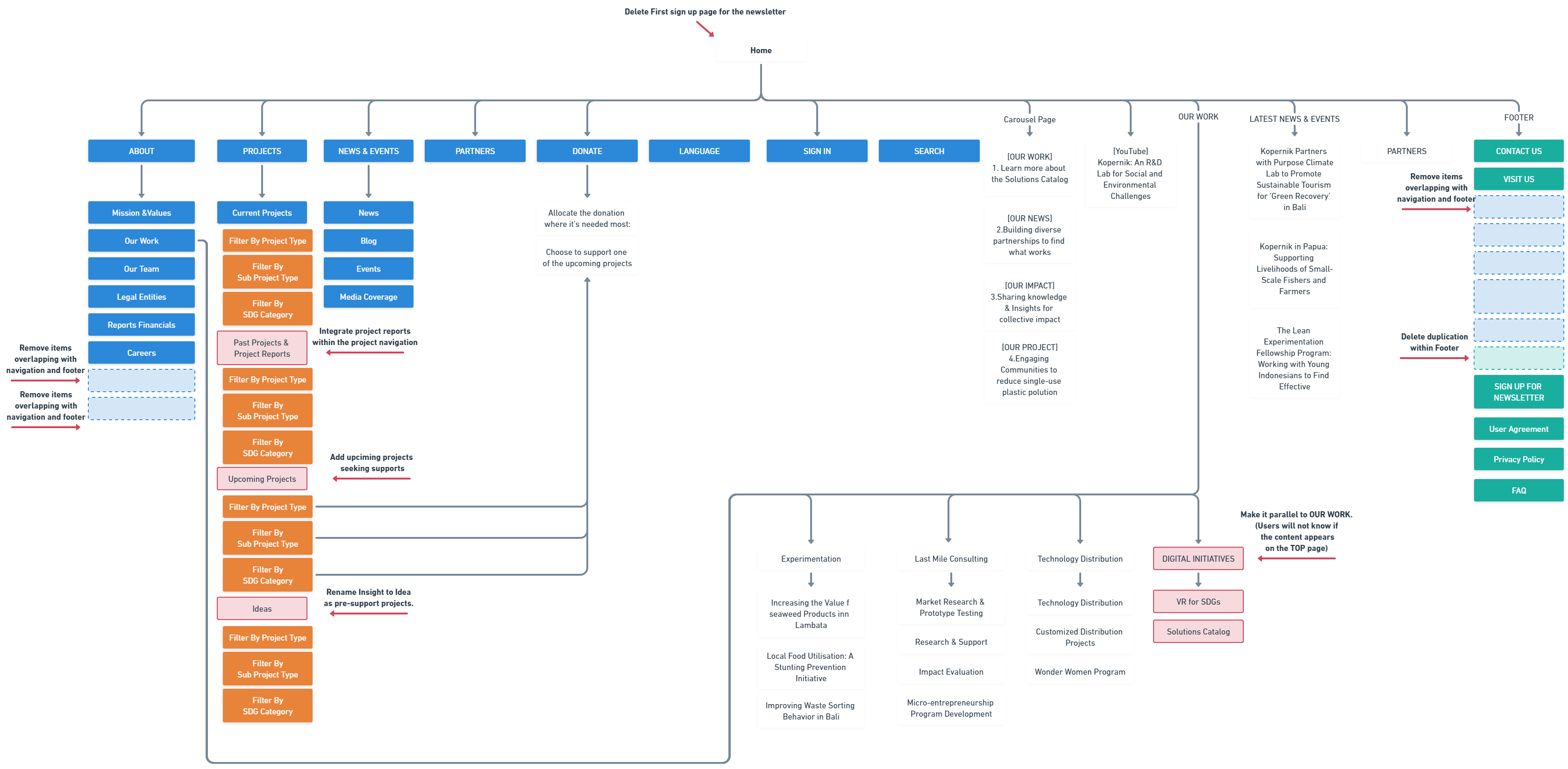
Current sitemap analysis revealed duplicate navigation elements and confusing footer structure. Navigation items are shown in blue, filters in orange, content in white, and footer in green.
Card Sorting Results
Open card sorting with 5 participants and 30 cards
Key Clusters
| Cluster | Similarity | Frequency |
|---|---|---|
| Product Info | 89% | 95% |
| Customer Support | 82% | 80% |
| Corporate Info | 95% | 100% |
| Results/Case Studies | 65% | 70% |
Findings
Pattern: 'SIGN IN' Navigation menu grouped to Footer by 66% of participants
Pattern: 'INSIGHTS & REPORTS' Navigation menu grouped to Contents by 66% of participants
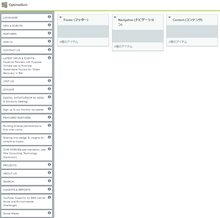
Open Card Sorting with 5 participants (User A, B, C, D, E) using 30 cards. Results showed that the original placement is relatively acceptable, but content needs to be reorganized according to mental models. Key clusters: 'SIGN IN' Navigation menu → Footer (66%), 'INSIGHTS & REPORTS' Navigation menu → Contents (66%). Main clusters identified: Product Info (89% similarity, 95% frequency), Customer Support (82% similarity, 80% frequency), Corporate Info (95% similarity, 100% frequency), Results/Case Studies (65% similarity, 70% frequency).
Card Sorting Results
Open card sorting with 5 participants and 30 cards
Participant IA Patterns
participant 1
Traditional 3-part structure (Products, Support, About Us)
participant 2
Business-oriented 'Solutions' approach
participant 3
Japanese-friendly labels
participant 4
Detailed category names
participant 5
Abstract 'experience-type' labeling
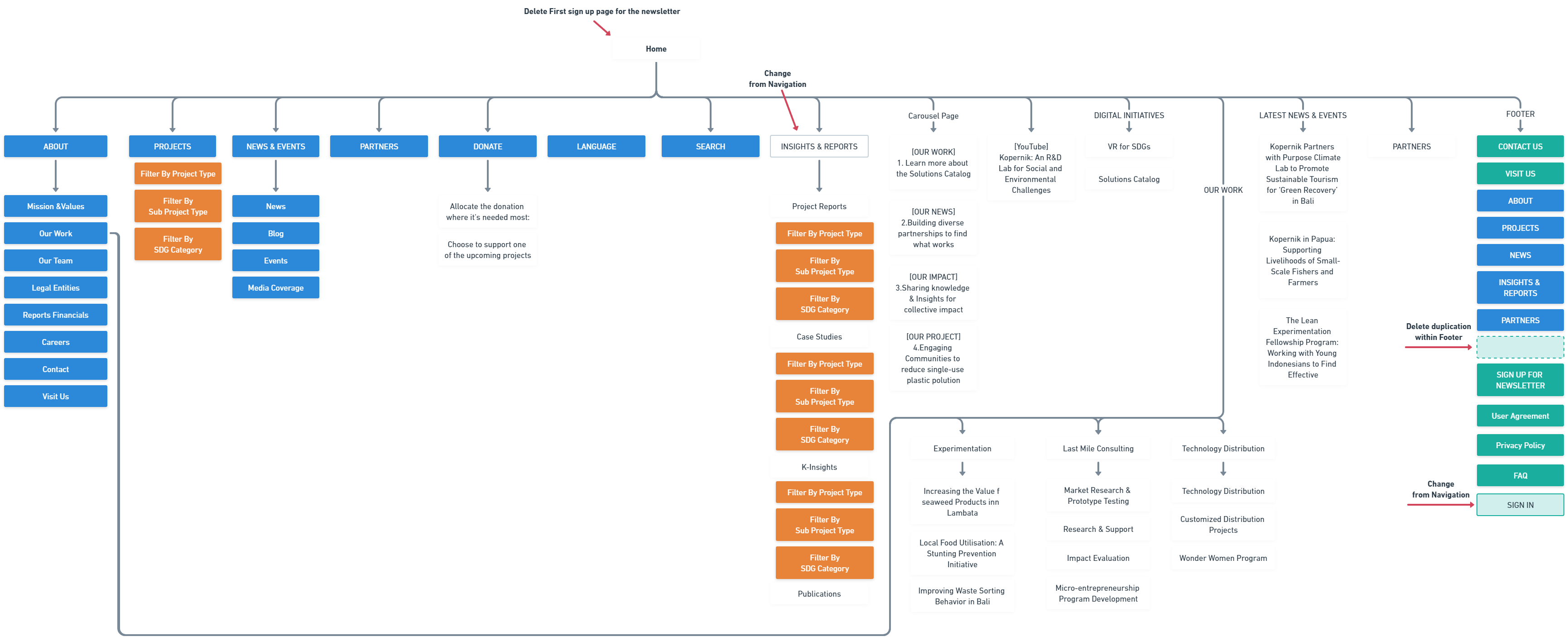
Visualization of how 5 participants organized content during card sorting, revealing diverse mental models. Participant patterns: Participant-1 used traditional 3-part structure (Products, Support, About Us), Participant-2 focused on business-oriented 'Solutions' approach, Participant-3 preferred Japanese-friendly labels, Participant-4 used detailed category names, Participant-5 adopted abstract 'experience-type' labeling. The three groups bordering the red line represent the original header & navigation, content, and footer respectively.
Optimal Workshop was used to conduct Hybrid Card Sorting, helping identify user mental models and information architecture preferences.
Usability Testing Results
Results from usability testing with 3 users and user interviews
Task Completion Status
| Task | Completed |
|---|---|
| Visit the site for the first time and learn about the organization | ✓ |
| Learn about the organization's activities | ✓ |
| Donate or sign up for the newsletter | ✓ |
User Interview Results
| Question | Result |
|---|---|
| Perceived Ease of Use | Neutral |
Positive Findings
✓
All test users were able to complete tasks
Negative Findings
⚠
Users not knowing the difference from other NPOs
⚠
Users not believing projects are really taking place
⚠
Confusing navigation names in Japanese version
⚠
Unclear content intent
Usability testing was conducted with 3 participants who have donated or would like to donate to the organization. All test users were able to complete tasks, but the website had usability problems. Deep Research results: Agile development approach - initial usability testing reduced development costs. Key improvements: onboarding bottlenecks resolved, steps to reach target content reduced. Example: order time reduced from 5 minutes to 2 minutes after redesign.
Design Process
Design Evolution
I created two design propositions based on card sorting and usability testing findings. After receiving feedback from the client (mentor), I went through a last iteration that addressed specific revision requests, including matching content grid, changing donation status bar to grayscale, and integrating self-introduction and work descriptions.
First proposed IA update reflecting only what we learned from card sorting. This is a modest proposal that maintains the original structure while addressing key findings.
Second proposed IA update reflecting card sorting results and interview findings. Includes renaming 'INSIGHTS & REPORTS' to 'Past Projects' and 'Ideas', creating 'Upcoming Projects' section, and moving 'DIGITAL INITIATIVE' alongside other work.
Testing & Iteration
Iterations
The final design iteration addressed client feedback including: matching content grid for self-introduction, changing red donation status bar to grayscale, and integrating standalone content into OUR WORK section.
Improvements
The new design met the nonprofit's main goals and improved the user experience by combining content soliciting donations from users with its CTA, revising information architecture for clearer layout, and addressing usability issues identified in research.
Quantitative Results
Donation CTA Conversion Rate
0%+
increase
Expected increase in donation CTA conversion rate
Newsletter Sign-ups
0%+
increase
Expected increase in newsletter sign-ups due to new copy
Session Time per User
0%+
increase
Expected increase in session time by integrating organization's performance into landing page
Qualitative Results
User Test Results
All test users were able to complete tasks successfully. Users had good reactions to the UI and navigation menu. However, users expressed concerns about newsletter sign-up pop-ups, confusing navigation names in Japanese version, and lack of clarity about project activities.
Client Feedback
Client (mentor) provided specific revision requests including matching content grid, changing donation status bar to grayscale, and integrating self-introduction and work descriptions. The final design was approved after addressing these requests.
Reflection
Learnings & Growth
After evaluating and digging into the website's information architecture, we discovered issues such as users not knowing why content was here and some duplication. Copy and design, including visualization of information and benefits of action, are important not only for CTA buttons but also for getting users to take action.
Hindsight
This new design does not completely solve the problems identified in the research. It is important to turn the iterative approach around quickly. Next steps include measuring the effectiveness of redesign, conducting usability testing, content audit, and card sorting to overhaul contents of each page.