Loading project...

Project Context
Role
UX Designer
Team
Solo project (OpenClassrooms Project)
Duration
Apr 2022Jun 2022
3 months
3 months
Tools
ZoomUX TweakOptimal WorkshopBlackmagic
Identify areas for improvement by looking for hotel websites that may have room for improvement and conducting usability tests
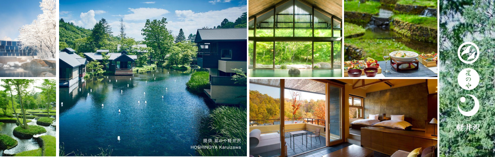
Research Question
What are the usability issues on the Hoshinoya Karuizawa website that make it difficult for users to book a villa easily?
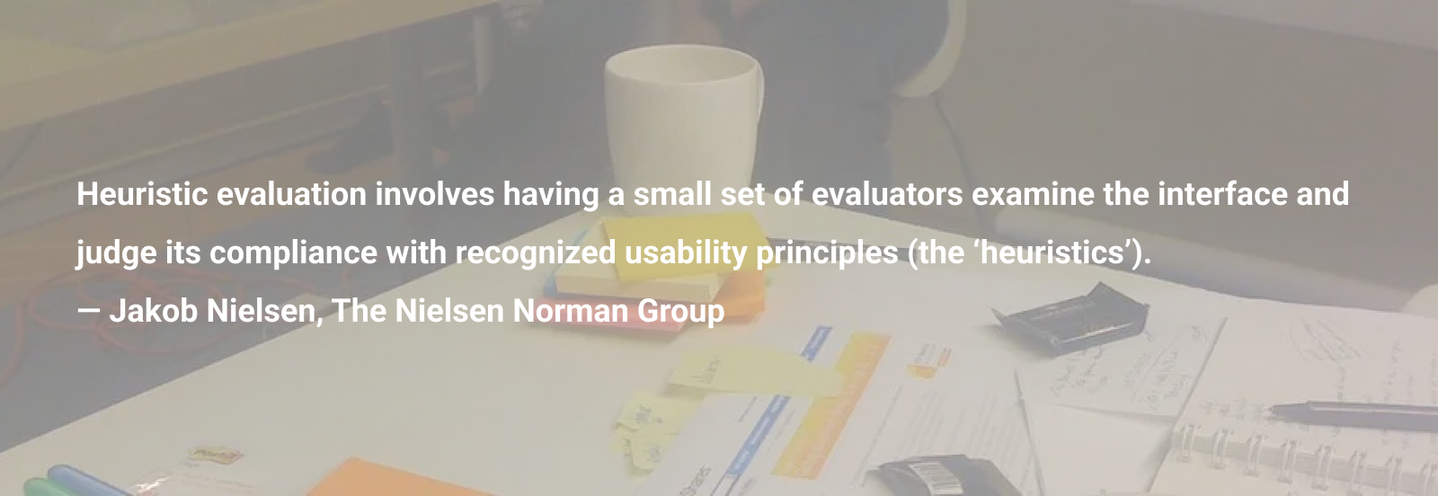
Research Methodology
I conducted Heuristic Evaluation using Nielsen Norman Group Jakob's 10 Usability Heuristics, Usability Testing with 5 users through recorded Zoom calls, and Card Sorting (both closed and open card sorting) using Optimal Workshop.
Additional Visuals
Usability test plan dashboard outlining the goals, scenario, tasks, and user demographics for testing the Hoshinoya Karuizawa website booking process.

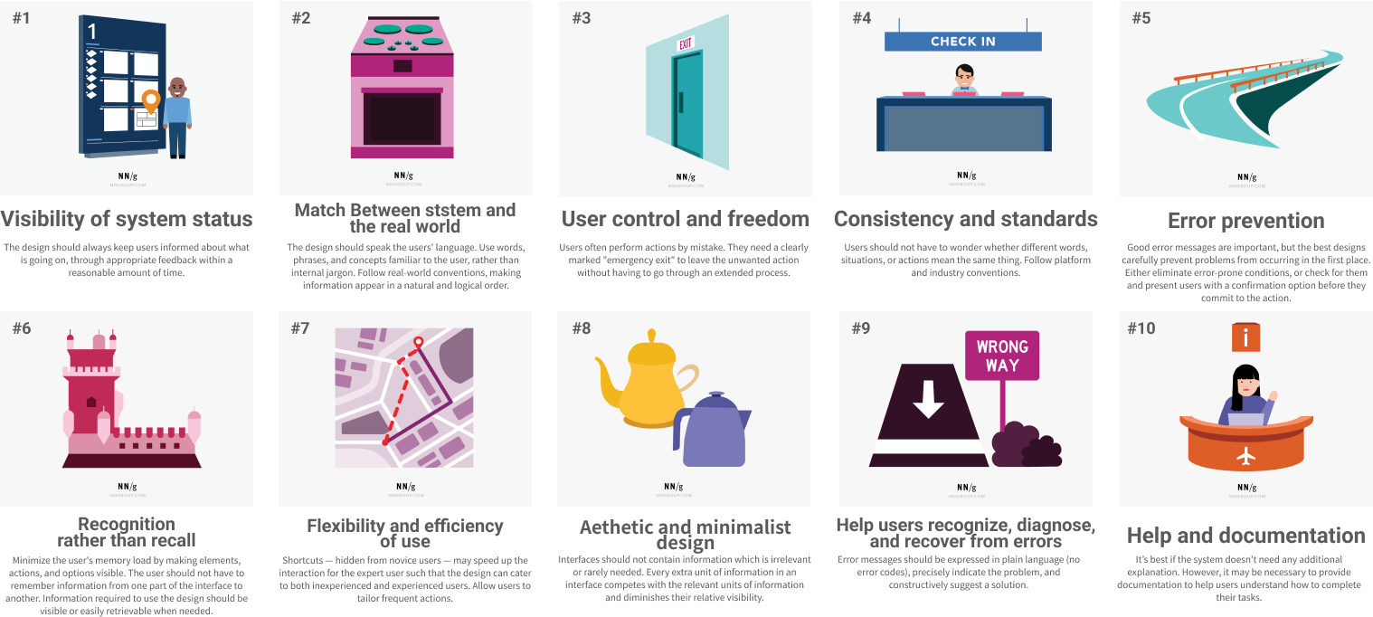
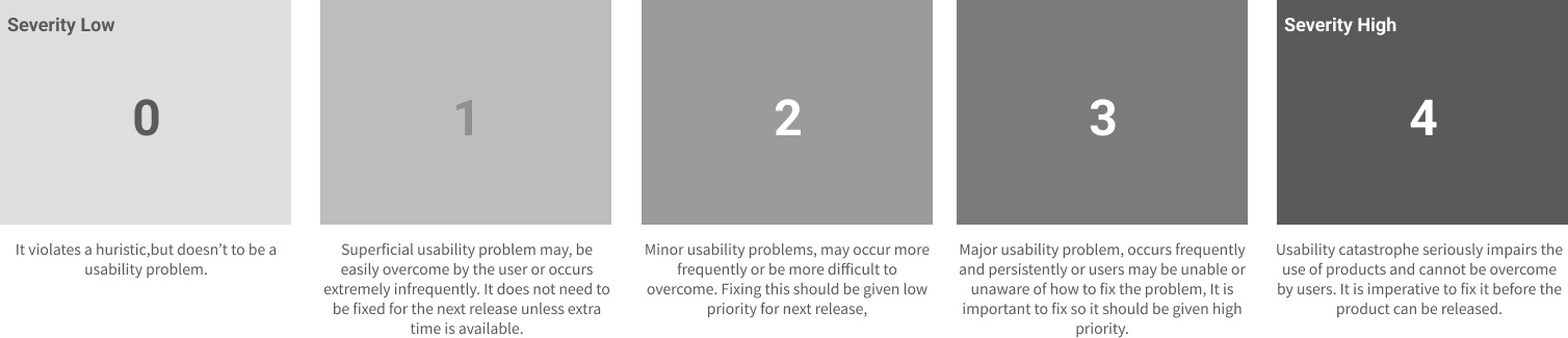
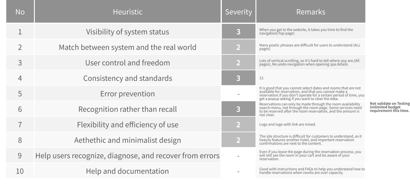
Heuristic evaluation was conducted using Nielsen Norman Group Jakob's 10 Usability Heuristics to identify usability issues on the Hoshinoya Karuizawa website. Problem severity ratings were assigned to each issue.
Usability testing results showing task-by-task success rates and error counts. Deep Research results: Task 1 (Hotel search): 100% success rate, 120s average time, 1 error. Task 2 (Filter application): 66.7% success rate, 85s average time, 3 errors. Task 3 (Date selection): 33.3% success rate, 210s average time, 5 errors (critical bottleneck). Task 4 (Reservation completion): 100% success rate, 45s average time, 0 errors. Success rate formula: $SR = rac{(s + (0.5 imes f))}{n} imes 100$ where s = complete successes, f = partial successes, n = total participants.
Participant profile information including age, experience level, and demographics. Deep Research results: Participant profiles reveal that even advanced users (p-3: frequent business traveler, 42 years old, male) struggled with Task 3 (date selection), indicating this is a critical issue that affects users regardless of skill level.
Findings
Key findings include: Positive - Villa Galleries have nice Photos, The booking process did not cause any problems, It describes not only the address but also how to get there. Negative - It takes time to go back to the top of the page, No detailed information on the guest room page, There are places where you can press the logo to go back to the Top page and places where you can't, Contents have few images, Some content is clickable and unfolds within the same page while others move pages, The system is designed to search for available rooms by dates but does not support reservation methods by other purposes.
Key Findings
Top positive findings: Villa Galleries have nice photos, The booking process did not cause any problems, It describes not only the address but also how to get there. Deep Research results: Individual user actions revealed qualitative insights including positive user feedback on visual content and booking process usability. Note: Positive findings have been integrated into P3-4.png visual object for consistency.
Key Findings
Top negative findings and recommendations: It takes time to go back to the top of the page, No detailed information on the guest room page, Navigation inconsistency (logo navigation), Contents have few images, Interaction pattern inconsistency, Room search limitations. Deep Research results: Summary metrics including satisfaction scores and average completion times. Critical finding: Date selection UI (Task 3) requires immediate redesign - replace with native-friendly calendar component for mobile devices.
Recommendations
Improve navigation consistency - Unify interaction patterns (clickable vs. page navigation) and fix logo navigation to consistently return to homepage across all pages.
Add detailed information on guest room pages - Include floor plans, more images, and comprehensive details to help users understand the facilities and make informed decisions.
Enhance content with more images - Add visual content throughout the website, especially for content sections beyond rooms and facilities.
Support multiple reservation methods - In addition to date-based search, support room type-based search to accommodate different user preferences.
Add quick navigation controls - Implement a 'Back to Top' button or quick navigation controls to improve user control and reduce time to return to top of page.
Standardize menu behavior - Maintain consistent menu visibility and state throughout scrolling to provide clear system status feedback.
Learnings
Card sorting results revealed that users have different mental models for organizing content, highlighting the importance of user-centered information architecture.
Usability testing with real users uncovered issues that heuristic evaluation alone might miss, demonstrating the value of combining multiple research methods.
The importance of consistency in interaction patterns became clear - users expect predictable behavior across all pages and features.